
Brand identity

A mark built to still look considered in twenty years.

The Aurevon Digital identity is drawn on a strict geometric grid: one apex for craft, one ascending stroke for growth, one bar for trust. No gradients, no effects, no expiry date.

Aurevon Digital
Aurevon Digital

Stacked

Aurevon Digital

Light version

Aurevon Digital

Monochrome

The icon

One letter, three ideas.

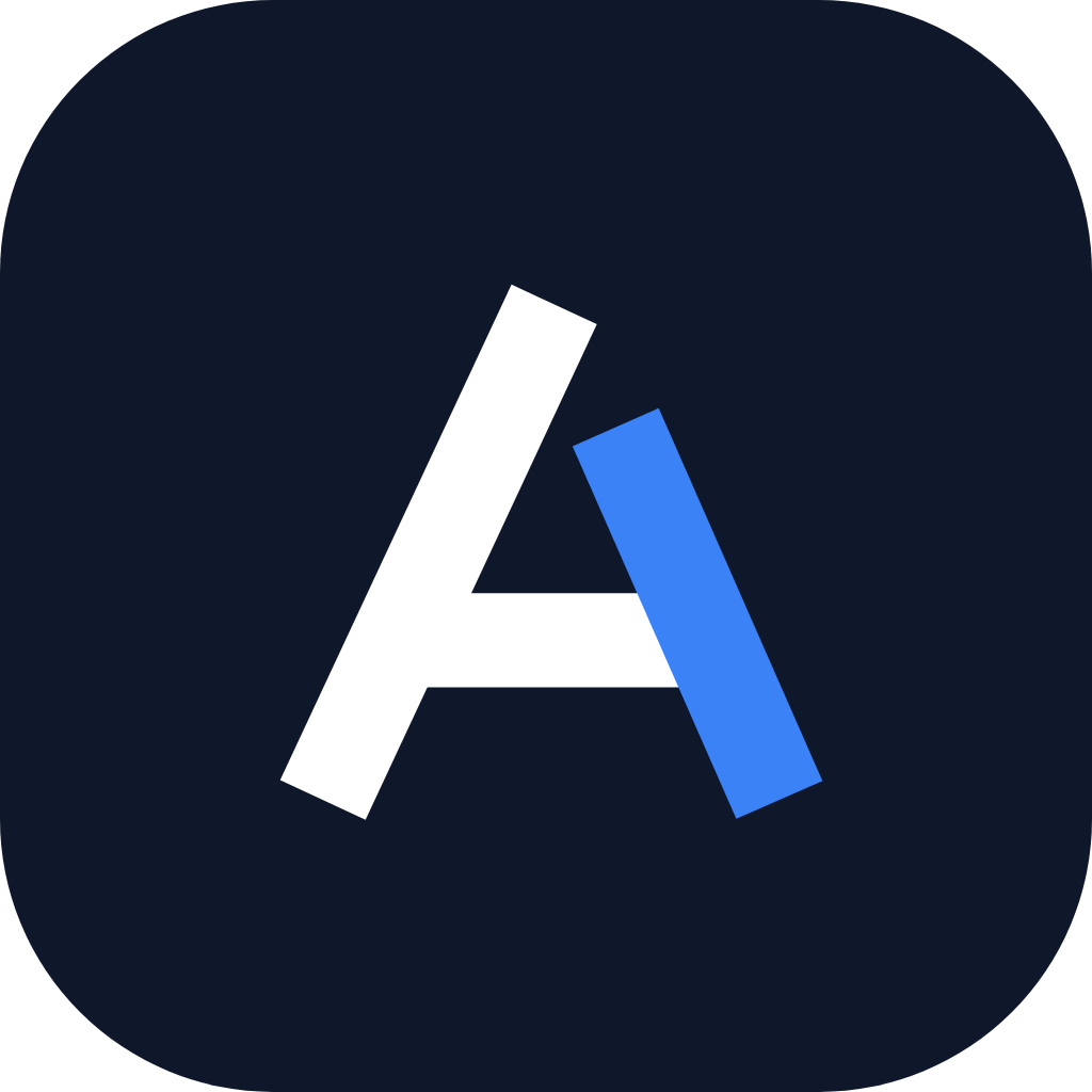
The mark is a geometric A: a full-height apex stroke, a shorter stroke that rises further than it should, and a crossbar that closes the form. It is legible at 16px and at 16 feet.

Apex stroke
Precision and craftsmanship.
Ascending stroke
Growth beyond the baseline.
Crossbar
Trust, structure, simplicity.

Usage sizes

App icon

Avatar

Header

Favicon 16px

Icon rules

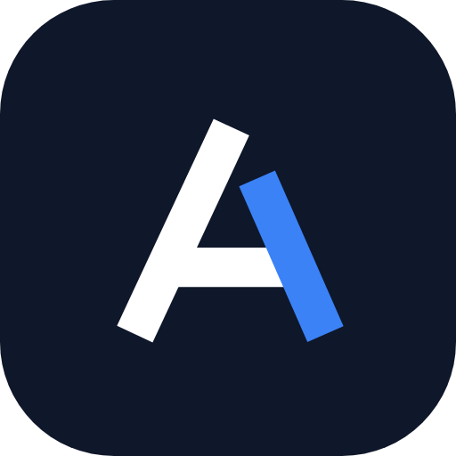
  • Navy tile with white apex for profile images and app icons.
  • Bare mark on white or light gray, never on busy imagery.
  • Never rotate, skew, outline or add a gradient to the mark.
  • Never re-colour the accent stroke outside #3B82F6.
Clear space & scale

The logo is never crowded.

Clear space equals the height of the mark's crossbar — measured as x on all four sides. Nothing enters that field: no type, no rules, no image edges.

Aurevon Digital
x clear space

Minimum sizes

Horizontal lockup — digital120px wide
Horizontal lockup — print32mm wide
Stacked lockup — digital88px wide
Icon only — digital16px
Icon only — print6mm

Placement

Website header uses the horizontal lockup at 32px mark height, left aligned. Footers and dark sections use the light version. Print, letterhead and square placements use the stacked lockup, optically centred on the wordmark.

Colour

Two colours. A lot of white.

Navy carries authority, blue carries movement, and white does most of the work. Blue never exceeds roughly five percent of any composition.

Deep Navy

#0F172A

Primary. Type, mark, dark surfaces.

Modern Blue

#3B82F6

Accent. Growth stroke, links, CTAs.

White

#FFFFFF

Primary background. Space is the brand.

Light Gray

#F8FAFC

Secondary surface. Section contrast.

Slate

#475569

Body copy, secondary type, mono lockups.

Typography

Inter, set tight and quiet.

One family, four weights, negative tracking on headlines. Inter stands in for Neue Haas Grotesk and matches SF Pro's proportions on every device.

Aa

Display · 600 · -3% tracking

Subhead · 500 · -2% tracking

Body · 400 · 1.65 line height. Set body copy at 16–18px with generous leading and a measure of 62–72 characters. Never justify. Never all-caps a sentence.

Eyebrow · 500 · +14% tracking

Wordmark hierarchy

“Aurevon” is set at 600 weight in Deep Navy. “Digital” is set at 400 weight in Modern Blue (or Slate in the dark version) at the same size. Word spacing is a single space — never a bar, dot or slash.

Aurevon Digital

Scale

Heroclamp 40 / 72px · 600
H2clamp 30 / 52px · 600
H320 / 24px · 600
H416 / 18px · 500
Body16 / 18px · 400
Applications

How it shows up in the world.

Business card

Aurevon Digital
aurevondigital.com

Founder & Lead Strategist

hello@aurevondigital.com

+1 (985) 397-1553

Social profile

Aurevon Digital

1024×1024 navy tile, mark at 58% optical width.

Favicon & browser

aurevondigital.com — Premium Websites & SEO

SVG favicon with a 64px PNG fallback and a 512px Apple touch icon.

Email signature

Aurevon Digital

Founder & Lead Strategist

hello@aurevondigital.com

+1 (985) 397-1553

aurevondigital.com

Use the 360px-wide transparent PNG so it renders on light and dark mail clients.

Website header

Aurevon DigitalBook a call
Two partner slots open this month

Ready to become the obvious choice in your market?

One free 30-minute call. You'll leave with a clear plan for more calls and more booked jobs — whether or not we work together.

No pressure, no contracts to sign on the call · Replies within one business day

Call nowBook call